

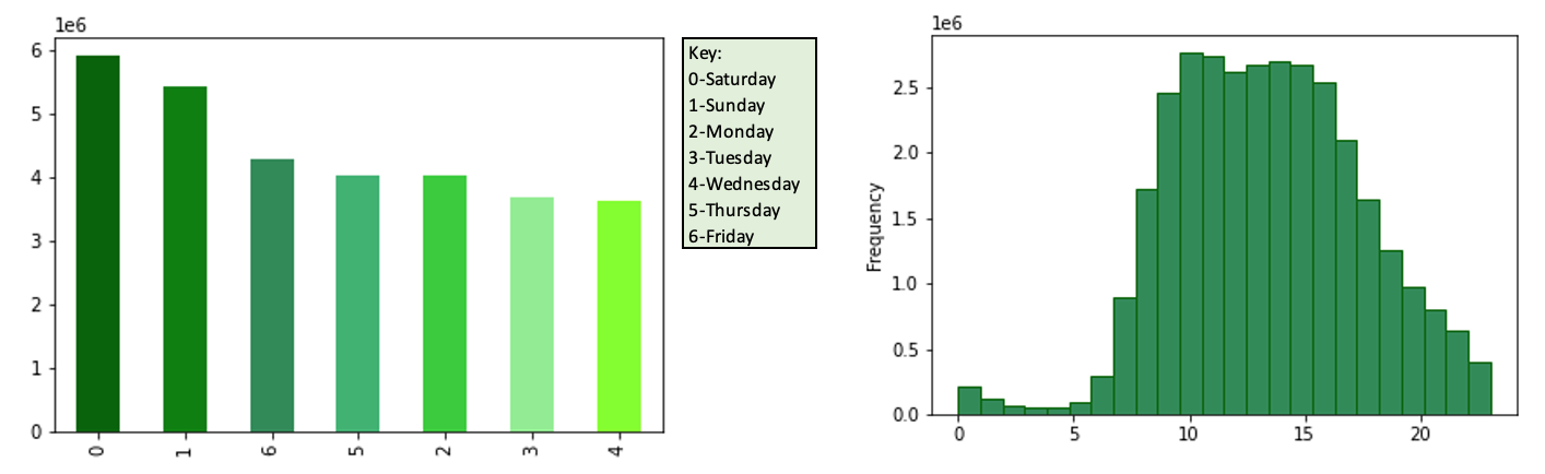
This bar graph represent the busiest orders of the week based on the number of orders placed each day. The most orders are placed on Saturday, Sunday and Friday.
This histogram represents the number of orders placed throughout the day. The most orders occur from 8am to 5pm.
Recommendations: To bring in more customers during slow periods of the day ads should be scheduled late in the evening , after 8pm, and in the early morning, 3-5am.
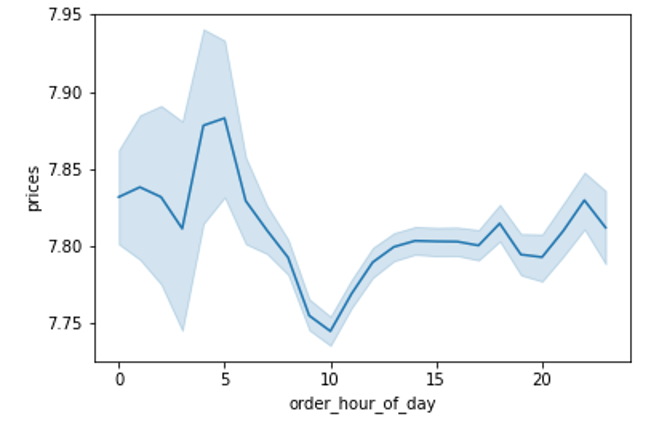
This line graph shows the price of products that are purchased throughout the day. The most expensive products tend to be purchased around 5am.
Recommendations: People purchase the most expensive products in the early hours of the day, therefore ads for more expensive products should be put out in the early morning.
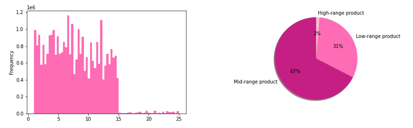
This histogram represents the frequency of the different product prices. The majority of products fall within the range of $1-15, with low frequencies of products costing more than $15
To simplify price range groupings, product price ranges were sorted into low-range, mid-range, and high-range product categories. The above pie chart represents the proportion of each category.
Low-price product: if prices <= 5
Mid-price product: if prices >5 & <=15
High-price product: if prices >15
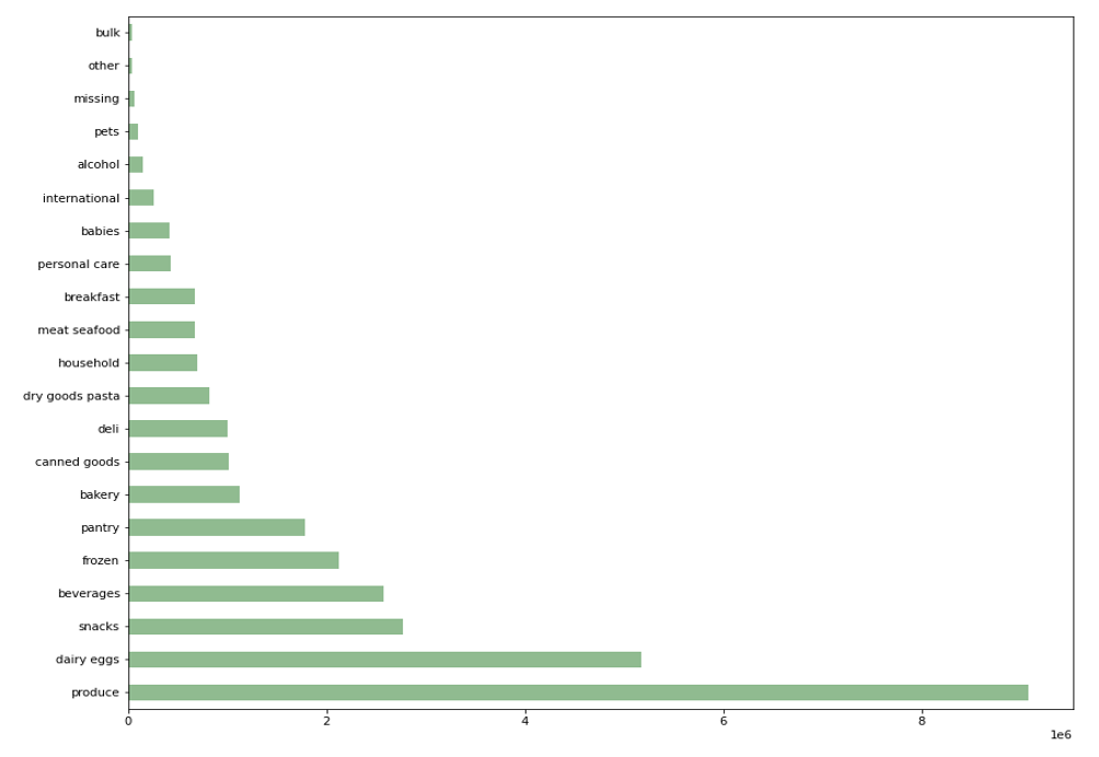
This bar graph represents the amount of products purchased in each department, in order of least to most popular. Very few purchases are made in the bulk departments, whereas the most purchases are make in produce, dairy/eggs, and snacks.
Recommendations: The marketing and sales team should focus on the bottom 5 departments that the least amount of products that are purchased, because departments like produce and dairy/eggs are staples in the household and customers will buy these without the sway of advertising. This would in turn increase profits greatly.
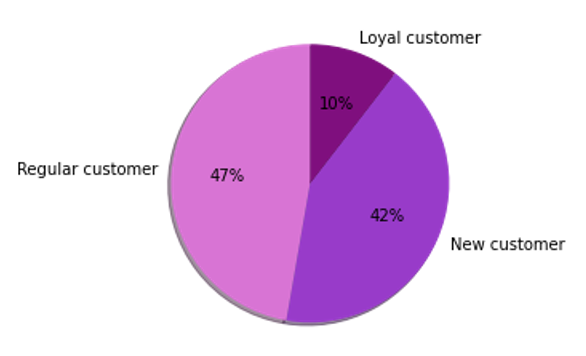
To simplify brand loyalty, groupings were organized by the maximum amount of orders each customer has made. They are sorted by new customers, regular customers, and loyal customer.
New Customer: maximum orders <=10
Regular Customer: maximum orders >10 or <=40
Loyal Customer: maximum orders >40
New Customer: 68,750
Regular Customer: 76,864
Loyal Customer: 17,017
Recommendation: A slight majority of customers regularly return to Instacart for their online grocery purchases, but there is not a very strong proportion of loyal customers. There must be an increase in loyal customers, to ensure that they will keep coming back and making repeated orders, therefore additional coupons and savings offers can be included into their ads. To bring in more new customers, we can provide a free 7-day trial if they are first time users, and continue to run ads to encourage their return.
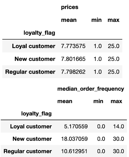
The above tables show the prices and median order frequency based on customer loyalty, these tables include the average, minimum and maximum of each value. Loyal customers have the fewest days in between each order, whereas new customers have the largest gap between orders. Overall, each type of customer spends relatively the same amount of money while shopping.
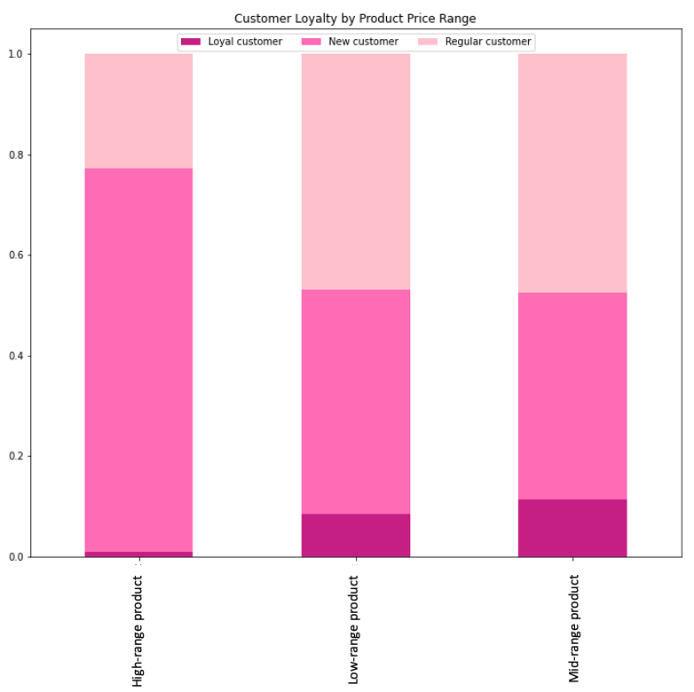
The bar chart represents the spending habits of customers based on their brand loyalty. New customers represent the largest portion of high-range product purchases, followed by regular customers. Overall, loyal customers make up the smallest portion of all price ranges.
Recommendations: We must find a way to encourage loyal customers to purchase high-range profits to increase company profits, as they are the customers who will continuously come back to make purchases. Additionally, ads should be run for new and regular customers to encourage them to become loyal customers of Instacart.
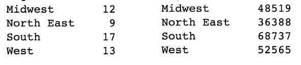
To the left shows the count of states within each region, with the south containing the most amount of states. Additionally, to the right we can see the number of unique users within each state, with the south having the most amount of users.
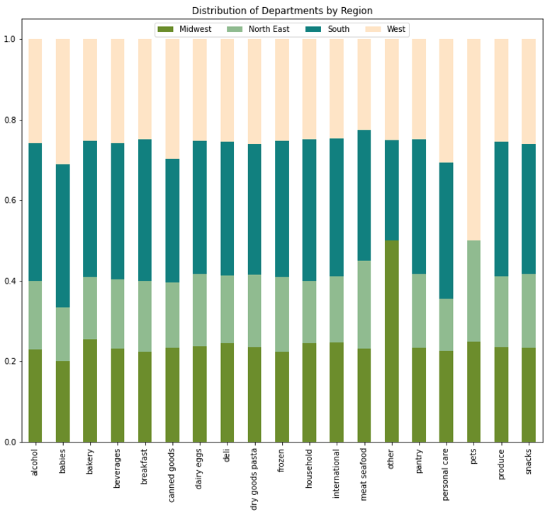
Most department types are normalized throughout each region with exception to pet in the West and 'other' in the Midwest. More ads should be run in the West that are pet related to encourage more customers who don't want to go to the store to buy their heavy pet food.
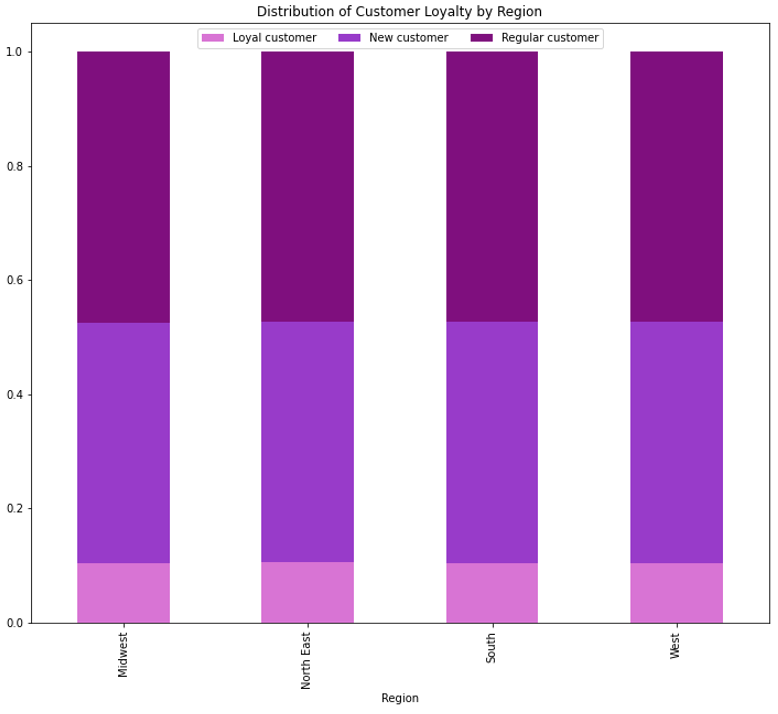
The stacked bar chart represents distribution of customer loyalty in each region. There is no difference in distribution of customer loyalty throughout the regions
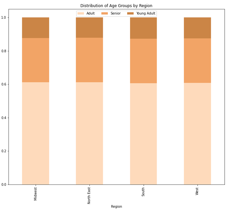
The stacked bar chart represents the distribution of age groups in each region. There is no difference in distribution of age groups throughout the regions.
To simplify the age of customers, groupings were organized into young adult, adult and seniors
Young Adults: age <=25
Adult: age >25 and <=65
Senior: age >65
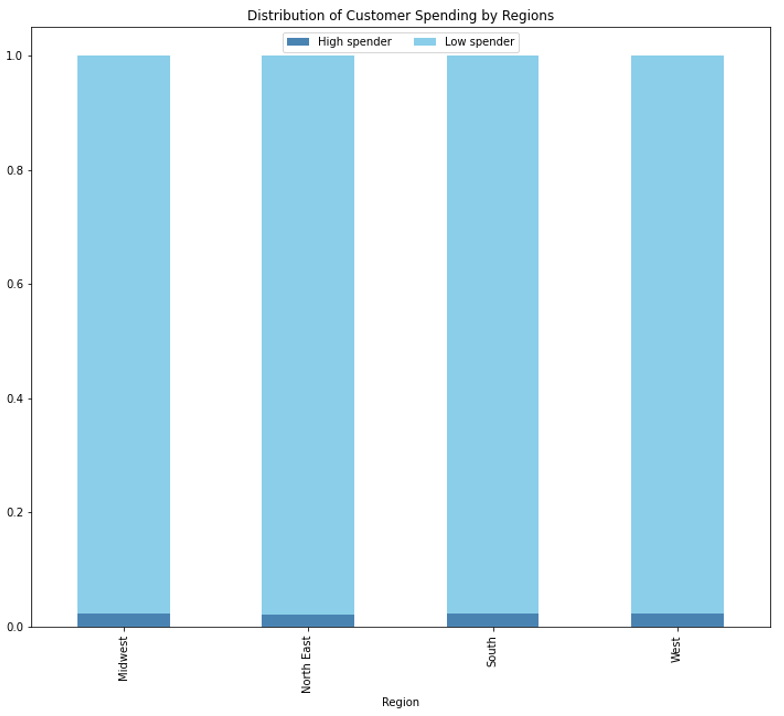
The stacked bar chart represents the distribution of customer spending in each region. There is no difference in distribution of customer spending throughout the regions.
To simplify customer spending, they were grouped by the average price that they paid for each order.
Low Spender: average price <10
High Spender: average price>=10
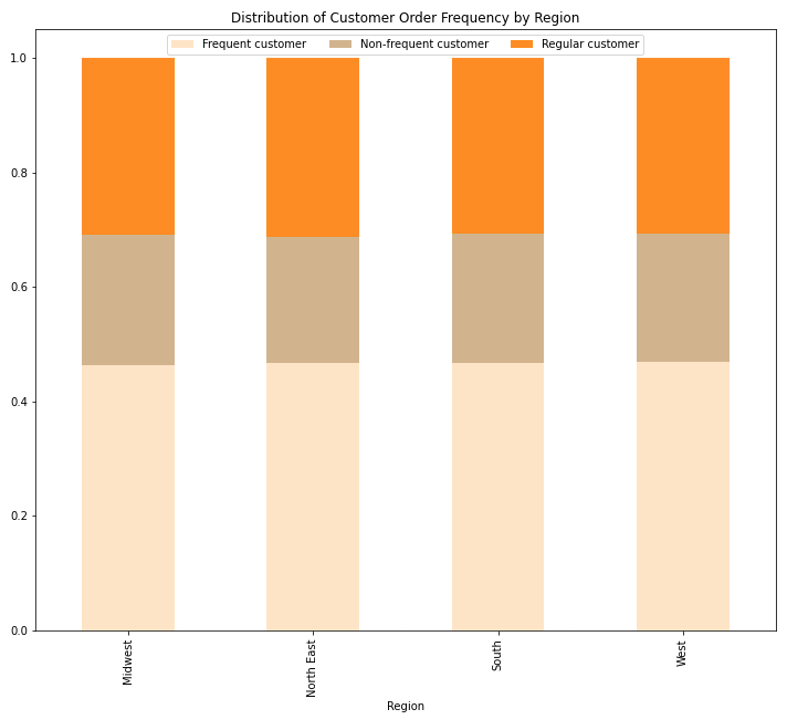
The stacked bar chart represents the distribution of customer order frequency in each region. There is no difference in distribution of customer order frequency throughout the regions.
To simplify customer order frequency, groupings were organized by their median order frequency, and organized into frequent, regular, and non-frequent groups.
Frequent: median order frequency <=10 days
Regular: median order frequency >10 and <=20 days
Non-Frequent: median order frequency >20 days
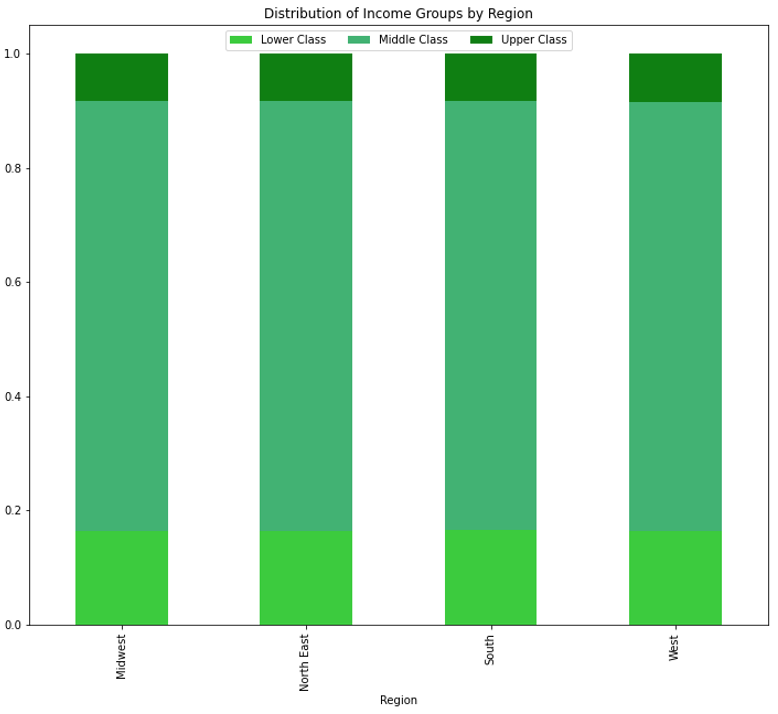
The stacked bar chart represents the distribution of income groups in each region. There is no difference in distribution of income groups throughout each region.
To simplify economic groups, groupings were organized by their income, and organized into lower, medium and upper classes.
Lower class: income <=52000
Middle class: income >52000 and <=156000
Upper class: income >156000
Recommendations: Although there is no difference in distribution between the different regions, it can e seen that not many young adults are using Instacart even though they are most inclined to use a convenient food delivery service. This may be based on the fact that they make the least of their fellow age groups, so in order to encourage there usership we can offer student discounts in our ads. Additionally we should aim to target customers who have higher incomes, as they would increase the purchases of higher priced products.
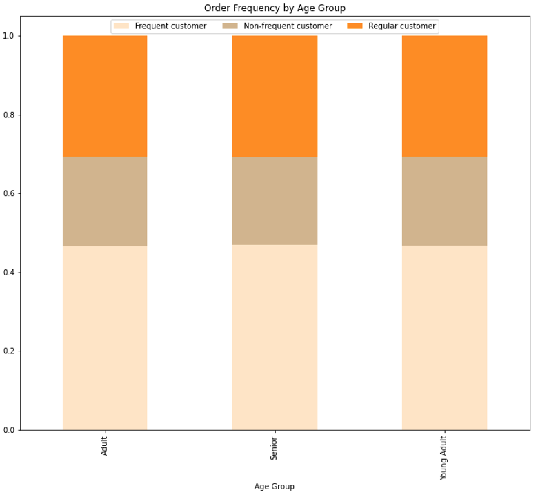
The above stacked bar chart represents the order frequency of different age groups. The graph shows that each age group has similar distributions of order frequencies, with about half of customers wtihin each age group being considered frequent and about 25% being non-frequent.
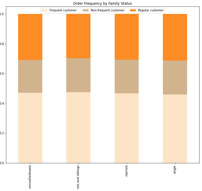
The above stacked bar chart represents the order frequency of each type of family structure, and as with age groups, they have a similar distribution of order frequencies with about half being frequent customers, and 25% being non-frequent customers.
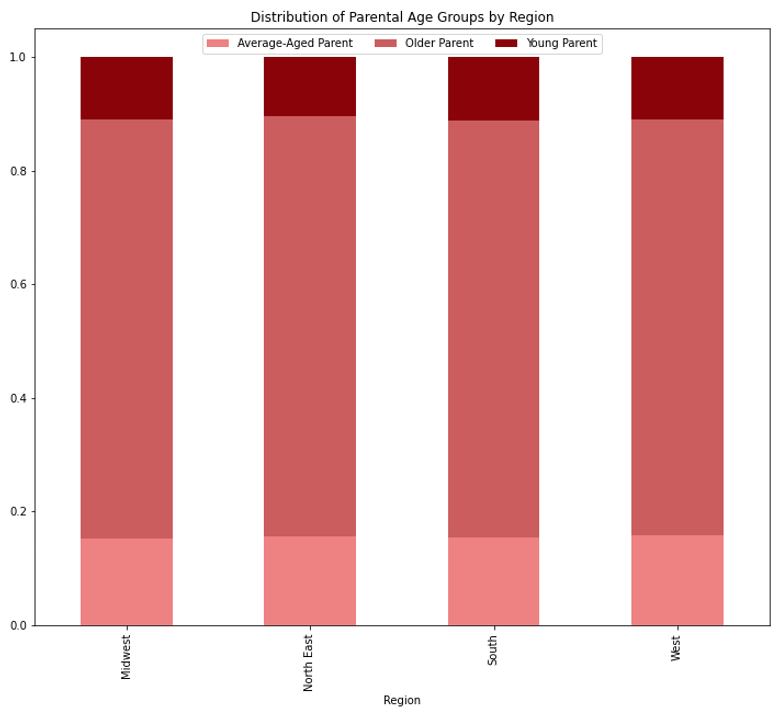
The above stacked bar chart represents the distribution of different aged parents throughout the different regions. The distribution of different parental ages in similar for each region, with older-parents, or parents older than 35, make up about 75% of customers in each region, and the other 25% is split between younger (<=25) and average-aged parents (>25 and <=35).
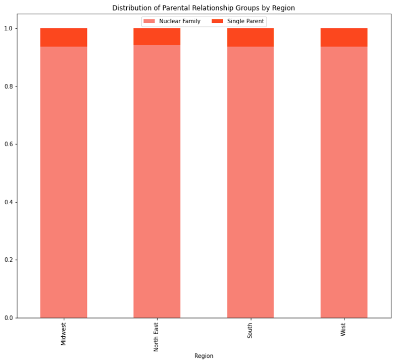
The above stacked bar chart represents the distribution of customers of different parental relationships throughout each region. Once again, the distribution of each group is equal between regions, with a near 95% of customers who are parents are in a relationship, or a nuclear family, and ~5% being single parents.
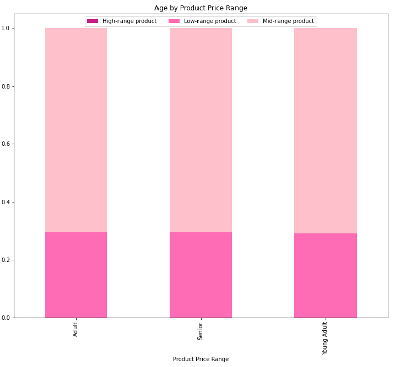
The above stacked bar chart represents the product price range of each age group, and shows that they are all distributed equally among the groups, with a higher proportion of mid-ranged products purchased, and no high-range products purchased among any age group.
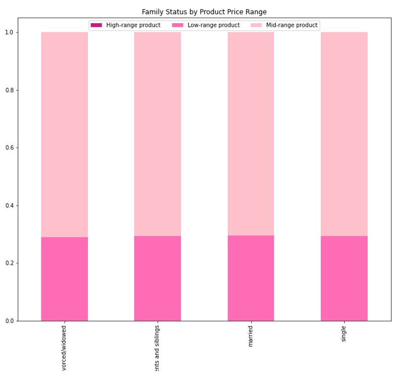
Above is a stacked bar chart representing the product price ranges purchased by customers of different family statuses. As with age groups, the price ranges are equally distributed amongst the groups, with a 75% proportion of mid-ranged products purchased, and no high-ranged products purchased.
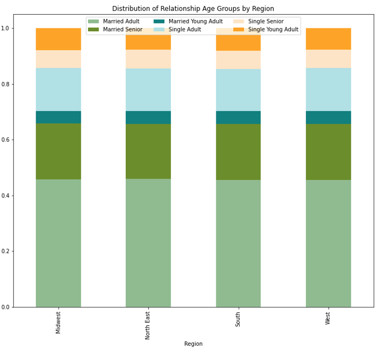
The stacked bar chart to the right represents the distribution of different age groups' relationship statuses. There is an equal distribution throughout all regions. Nearly half of all customers are married adults, whereas single seniors and married young adults make up the smallest portion of customers.
Recommendations: To increase the number of Instacart customers, ads can be run to target our younger users, including young parents and married young adults. We can create ads to show how more frequent usage can simplify their busy, fast moving lifestyles. The younger audience and young parents may be more succeptible to our ads and repeated usage because theiy tend to use technology to create a more efficient lifestyle.
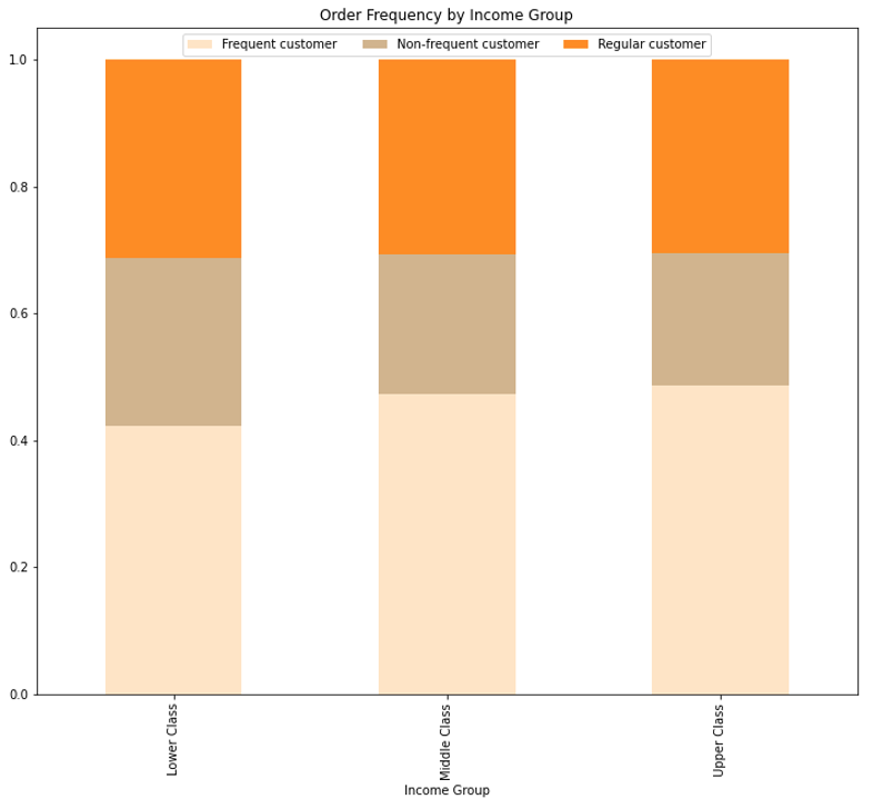
The above stacked bar chart shows the order frequencies of each income group. Middle and upper class customers have a similar distribution of frequencies with most customers ordering frequently, whereas lower class customers have a slightly different distribution. Lower class customers as shown to have more non-frequent ordering frequencies than the other income groups
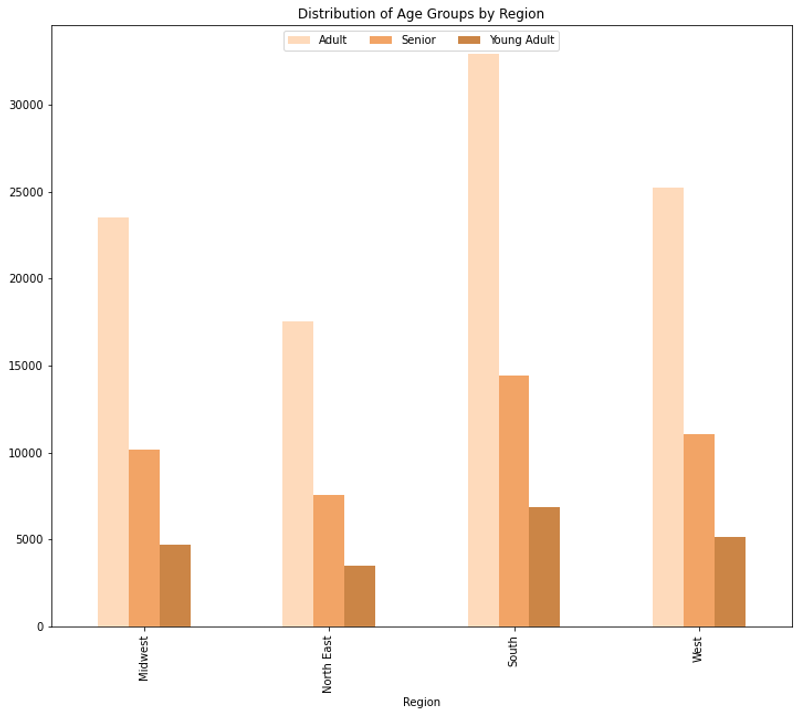
The above bar chart shows the age distribution of their customers throughout the different regions. The south is shown to have the most of all 3 age groups, which correlated with the fact that there are more states and more active customers in the southern states. Otherwise, the distribution of age groups is relatively equal between all four regions, in relation to population size.
Recommendations: As said previously, we should run more ads to target our younger users to encourage their frequent usage of the app. Making the app more user friendly may also encourage our older audiences to use our app more frequently as well, as they may be moving into a time in their life where they are not wanting to go into the grocery store anymore, but are not technology savvy.
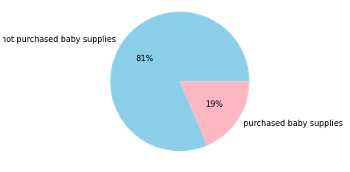
The pie chart show the percentage of customers who have purchased baby supplies, which inplies that they have young children. 19% of customers buy baby supplies
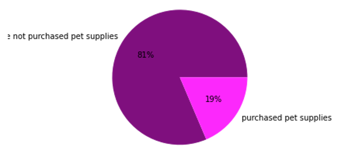
The pie chart show the percentage of customers that have purchased pet supplies, inferring that they have a pet. 19% of customers have bought pet supplies.
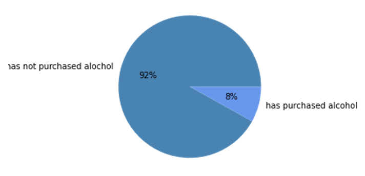
The pie chart shows the percentage of customers that have purchased alcohol. 8% of customers have bought alcohol.
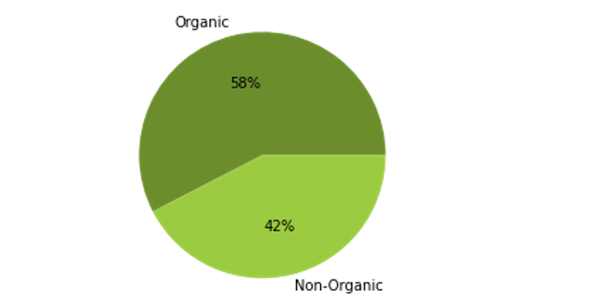
The pie chart shows the percentage of purchases of organic products, implying that the customer is health conscious. 52% of purchases include organic products.
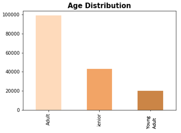
This bar chart shows the distribution of age groups of all customers. Adults make up the largest population of customers, and young adults make up the smallest portion of customers.
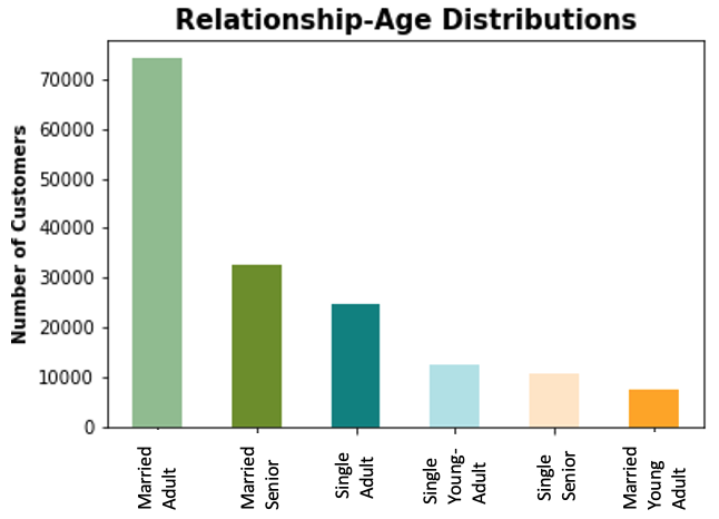
This bar chart shows the distribution of different age groups who are in a relationship or single. Married customers make up the largest group of customers, with married young adults and single seniors making up the smallest portion of the customer population.
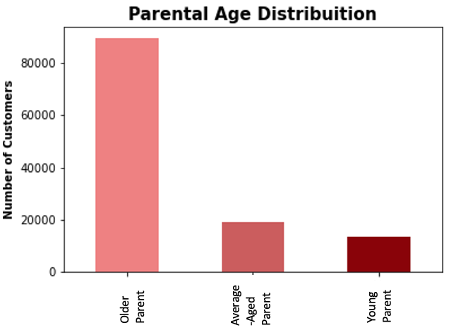
This bar chart show the distribution of different parental age groups. Most parents who use Instacart are considered older parents, or over the age of 35. This may be in part due to the fact that people are waiting to have children until they are older and more financially stable.
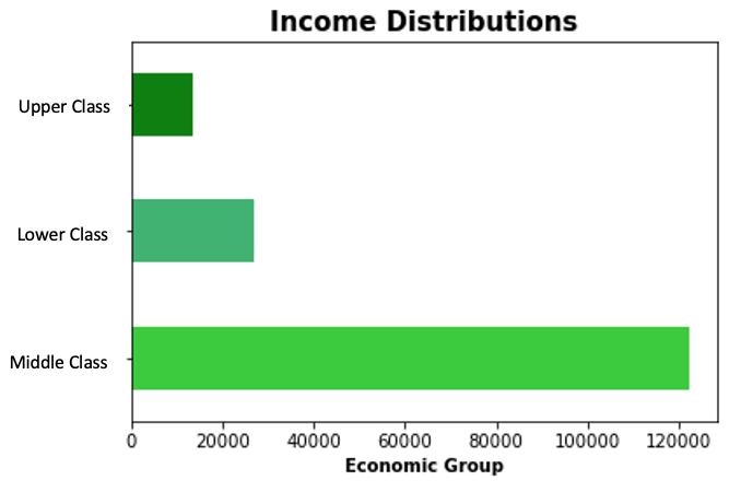
This bar chart shows the distribution of economic groups amongst out customers. Middle class customers make up a majority of Instacart users, followed by lower and upper economic groups.
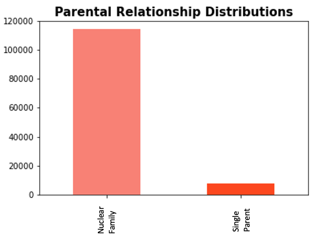
This bar chart shows the distribution of parental relationships, which indicates that a majority of parent customers are in a relationship.
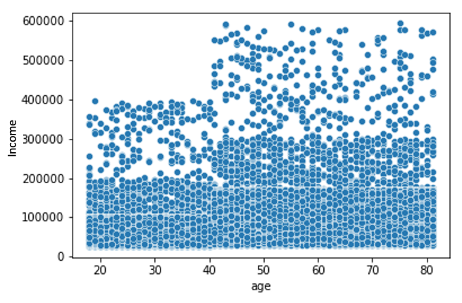
This scatterplot represents the spending power of customers in relation to their age. It shows that most users regardless of their age make around $20,000. Under the age of 40, the maximum income of our users is 400,000, but as they exceed 40 their maximum income goes up to 800,000.
Recommendations: After examining all f the above charts, we should focus on running ads for 3 main groups: young adults, young parents, and people in the upper economic class. As said previously, you adults and parents may be struggling to be able to afford using Instacart, so we can create a discount program for students or people with dependents. Additionally we can run more ads targeting people in upper classes because they have the money to afford higher-priced products and can increase the complanies revenue. They already have the means, we just need to create an easy environment so that our customers come back to us, as opposed to our competitors.
If you like what you see and want to work together, get in touch!
annahmendrin@gmail.com